Style K Studio

Sole UX/UI Designer & Researcher
Figma, Figjam, Optimal Workshop
2 weeks
Disclaimer: This is a concept project
Background
Style K Studio is a multi-brand retailer offering affordable yet prestigious fashion for men and women. With a dynamic inventory that blends trending and seasonless items weekly, the store focuses on uniqueness and exclusivity, encouraging a fun and engaging shopping experience. Embracing the tagline "ordinary is not enough," Style K Studio aims to supply an artistic collection, limited in quantity, fostering true self-esteem and value in its products.

The Challenge
To redesign the Style K Studio website to better showcase the variety of products offered and improve their online shopping experience while maintaining the brand image of "small shop" appeal.
The Problem
Shoppers want to feel confident in their purchases by having access to detailed product descriptions that they can trust. They can feel frustrated and discouraged when they are unsure how a product will look and fit and will, therefore, abandon their search and head to a competitor.
The Solution
The redesigned Style K Studio website offers an improved user experience with newly added navigation and customer reviews as well as enhanced product descriptions and intuitive filtering. The new website is likely to increase customer confidence, foster repeat business and elevate the brand’s online presence in the boutique clothing market.
The Design Process
Unraveling User Desires
User Interviews
I conducted user interviews in order to understand the journey of online shoppers as well as to discover the key pain points experienced when shopping online.


Usability Testing
Following each user interview, I conducted a usability test where I asked participants to find, select and simulate a purchase on the Style K Studio website.
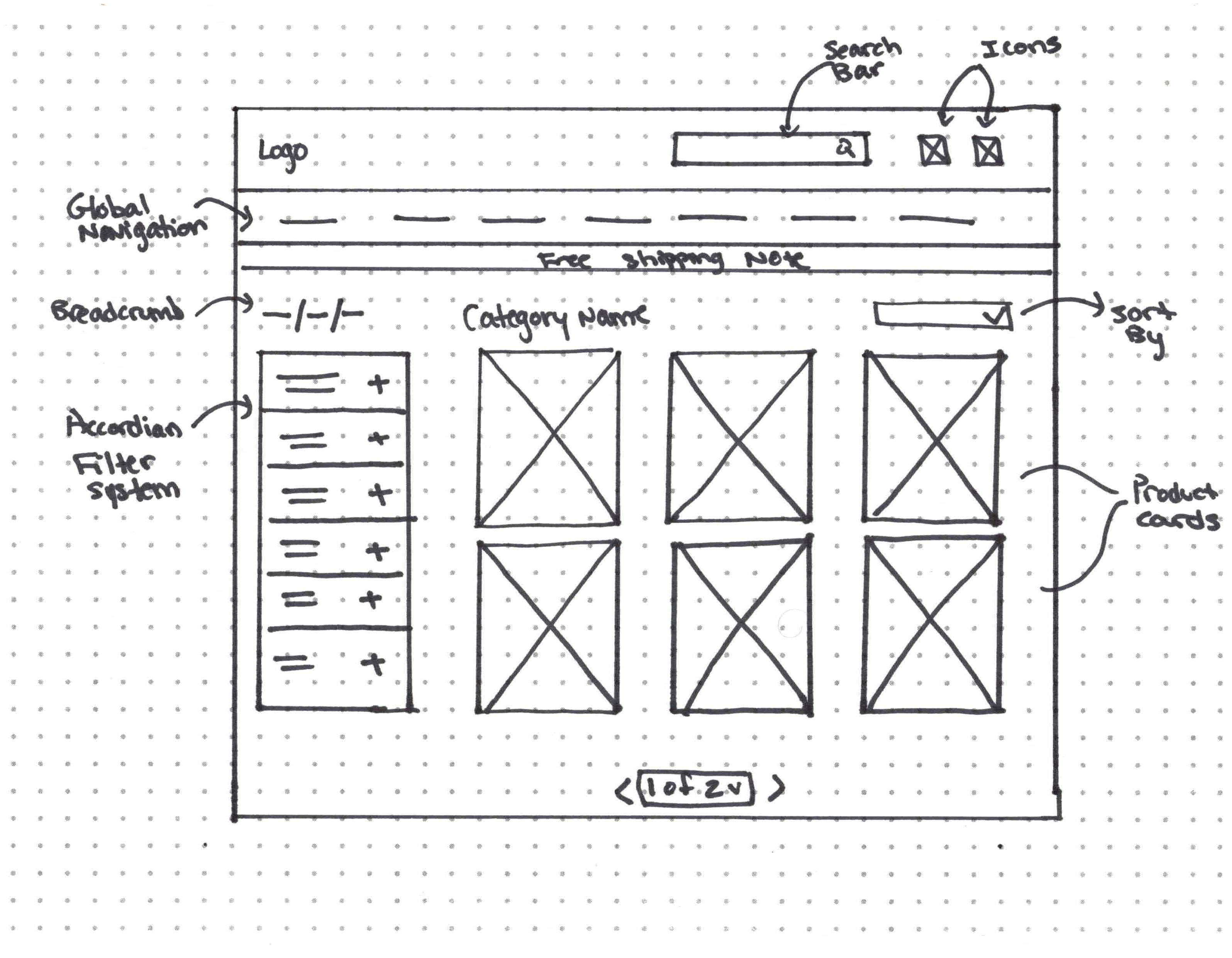
Pattern
Participants were frustrated with the amount of scrolling needed to view the product details on a product page.
Insight
Users want an intuitive way to access and view product details for a give item.
Solution
The product page layout and design could be revised to provide a more condensed or structured presentation of product details, reducing the need for excessive scrolling and making it easier for users to access and view information efficiently.
Pattern
Participants were initially confused on how to search for an item.
Insight
Users want clear cues indicating how to search for product items.
Solution
Enhancing the homepage by adding a prominent search bar and implementing a clear main navigation menu at the top could provide users with intuitive and accessible options to initiate item searches effectively.

Pattern
Participants were frustrated by the large product images, which made it difficult to see the entire product at a glance.
Insight
Users want images that enable them to get a clear understanding of product items.
Solution
Adjusting the image size on the website to maintain high quality while ensuring they are visually appealing and appropriately sized could enhance user satisfaction with product presentation and browsing experience.

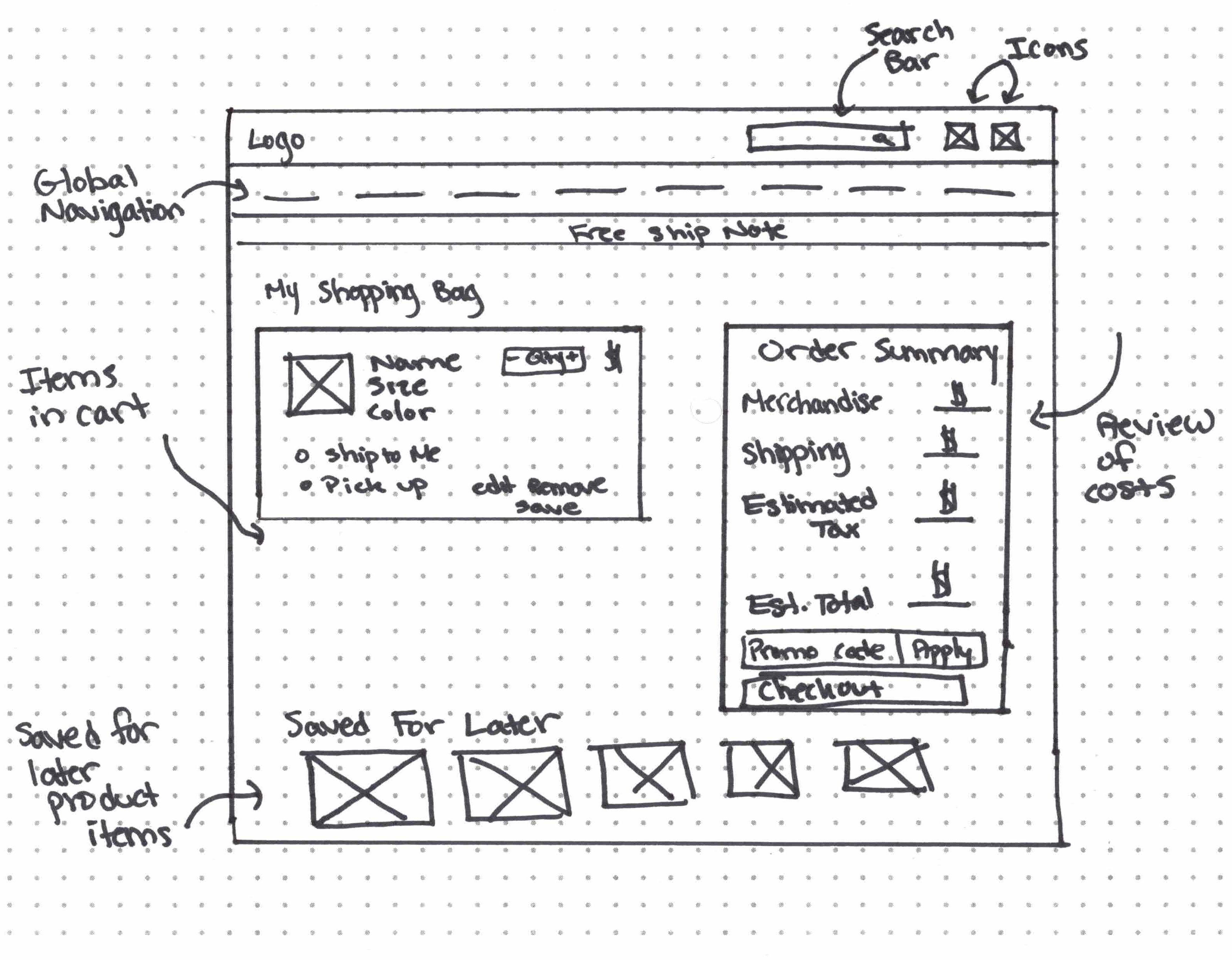
Pattern
Participants felt that the shipping cost and tax should have been stated in the cart.
Insight
Users want a clear indication of the total cost of an item before proceeding to checkout.
Solution
Incorporating a clear breakdown of shipping costs and taxes within the shopping cart interface could improve user transparency and satisfaction by providing a comprehensive view of the total item cost prior to proceeding to checkout.

Analyzing Style Showdowns
Competitive Analysis
In order to understand how other clothing e-commerce websites structure their experience, I conducted a competitive analysis, using 2 direct and 2 indirect competitors.


Results indicated that Style K Studio should incorporate features such as the ability to:
1. Filter products to refine search results.
2. Edit items within the shopping bag to allow shoppers to make any necessary changes.
3. Explore size options and a size guide to demonstrate inclusivity and instill confidence in selections.
Users Organizational Odyssey
Information Architecture
In order to address the confusion users had with locating specific products on the Style K Studio website, I conducted an open card sort to observe how users would categorize items when given the flexibility to create their own categories.
The results helped guide the restructuring of product items on the Style K Studio website.
Persona Unveiling
User Persona
Meet John!
John relies on online shopping to stay stylish amidst his demanding work schedule.

"For a fashion-forward professional like me, online shopping is the key to a stylish life—simple, convenient, and delivered to my door."
Goals:
- Enjoy the convenience of shopping online.
- Quickly and easily locate desired product items.
- Understand and review the product details before buying.
- Be aware of the price of items and any added costs.
Pain Points:
- Images of products are too large and not clear.
- Having to choose only one filter when trying to narrow down search results.
- When important information like shipping costs & shipping and return policies are not clear.
Setting the Problem Stage
Problem Statement
John, a busy professional with a passion for fashion, needs a way to see in-depth product information so that he feels confident making a purchase.
Weaving Solutions in Questions
How Might We
How might we create a way for users to feel confident with the items they purchase?
How might we establish trust to encourage repeat customers?
How might we create a way to educate users about products?
Sketching Chic Beginnings
Sketches
I created sketches that represent the common flow of shopping online so that users feel comfortable with the process.
I wanted to keep the uniqueness of the Style K Studio brand while incorporating features that would improve an online shopper’s experience.


User-Tested, Fashion Approved
Usability Testing
Utilizing mid fidelity prototypes, I conducted usability testing on 5 participants to evaluate whether the changes that I made would effectively address the pain points identified with the original Style K Studio website.
While analyzing the data two key patterns were identified and labeled as high priority.
Mid-Fi
Before Usability Testing

Participants were initially confused on how to search for the desired item.
Hi-Fi
After Usability Testing
The shop men and shop women buttons were removed so users can focus on the search and navigation bar.
Mid-Fi
Before Usability Testing

It was not immediately clear how to write a review.
Hi-Fi
After Usability Testing

Modified the process of writing a review by adding a clear button with a hover state to indicate that it is clickable.
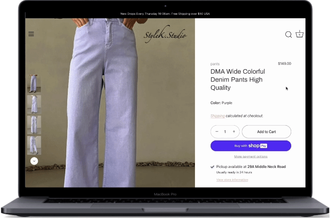
The Pixel Runway
Final Version
Building Blocks of Style
Style Guide
The absence of a defined color palette on the original website prompted my decision to introduce a simple and elegant neutral palette for the redesign, a choice that intricately mirrors and enhances the brand's essence by conveying a refined and timeless aesthetic.Additionally, I opted to blend a serif with a sans-serif font to strike a balance between classic sophistication and contemporary flair, enhancing the overall user experience and reflecting the brand's versatile and timeless appeal.
Style Without Barriers
Accessibility Considerations
Conveying Information
Labels and icons were used in addition to color to emphasize points and distinguish content.
Sufficient contrast
Contrast met WCAG compliance.
Hover States
Hover states were used to highlight elements that users could select.
Visible Actions
Available actions are clear at all times.
Reflections
Through the process of redesigning the Style K Studio website, I gained invaluable insights into the dynamic world of UX design. One of the key lessons I learned was the importance of user research in shaping a customer-centric experience, as it guided decisions throughout the entire design process. I thoroughly enjoyed the iterative nature of prototyping and testing, witnessing firsthand how user feedback fueled continuous improvement.
Looking ahead, I am eager to further refine my skills, explore emerging technologies, and contribute to creating innovative and user-friendly solutions in the ever-evolving field of UX design.