Molskine Connect

Wireframe & Prototype Lead, Design Lead, UX Researcher, UX Writer
Figma, Figjam, Google G Suite.
2.5 weeks
Disclaimer: This is a concept project
Background
Moleskine, an internationally recognized notebook and stationary company is known for its commitment to craftsmanship, quality materials and timeless design. Over the years, the company has expanded its product range to include various notebooks, planners, bags and writing tools, maintaining a balance between heritage and contemporary innovation.
Moleskine bridged the gap between handwritten notes and technology by creating their Smart Notebooks as part of the Moleskine + Collection. Pairing the smart notebook and smart pen with the Moleskine app, allows users to watch as their creations are automatically transferred to the digital form.
The Challenge
To create a brand new social networking experience that enhances the creative process of Moleskine Smart Notebook users by allowing them to engage and share their work with others.
The Problem
Moleskine Smart Notebook users want to share their creative work, either publicly or anonymously, within a poetic, positive and genuinely creative platform that encourages collaboration and provides inspiration. Creative writers and artists can feel lost and unsupported without a community to share their work, receive feedback and get inspired by others.
The Solution
Introducing Moleskine Connect, a platform that enables Moleskine Smart Notebook users to seamlessly share their creative work. Users can showcase their documents, add titles and descriptions, and selectively share within specific communities. Moleskine Connect fosters collaboration, feedback, and inspiration, creating a poetic and positive space for creative expression.
The Design Process
Ink-sights In Spiral Sessions
User Interviews
My team and I conducted user interviews to understand the journey of sharing written content on social media platforms.
I facilitated sessions with my team to analyze the results of our interviews and identify the key motivations, behaviors and frustrations of sharing work on a social media platform.


Peeking at Others’ Pages
Competitive Analysis
To get a sense of how current social media platforms structure their experiences, my team and I chose to conduct a pluses and deltas competitive analysis. I suggested that we analyze Pinterest, Reddit and Instagram to identify key strengths and weaknesses that would help to create and design a positive user experience for Moleskine Connect.

- Can explore creative content for inspiration.
- Multimedia content.
- Collaborative board feature facilitates planning and creativity.
- Users can share their ideas and creations.

- Prioritizes visual content over written content.
- No real time feedback limiting the immediacy of user interactions and conversations.
- Fosters active discussions and engagement within communities.
- Can customize content by selecting communities to follow.
- Can communicate with others by sending messages.
- AMA sessions allow users to interact with people from various fields.
- Primarily text based which can affect users who rely on media for information.
- Users may need to sift through content to find valuable information.
- Can discover new content based off interests.
- Can make a private account so only followers can see your posts.
- Can communicate with others by sending direct messages to followers and non-followers.
- Encourages user engagement through likes, comments and direct messages.
- Primarily visual content.
- Focus is on gaining likes, comments and followers creating pressure on users.
Results indicated that Moleskine Connect needs to be a platform where users can:
1. Seek inspiration from others
2. Interact with other users discussing creative work and providing real time comments and/or feedback
3. Express themselves through content
4. Edit and customize who sees the content they share
Character Quills in Notebook Tales
User Persona
Meet Paige!
Paige is passionate about verbal and visual storytelling and is always taking notes and writing down ideas in her Molskine Smart Notebook.

"I share my work to inspire and draw inspiration from the diverse creativity of others."
Goals:
- Share her notes and creative writing from her tablet.
- Seek inspiration from others to guide new work.
- Form meaningful connections with other people.
Pain Points:
- Wants to share her creative work from her tablet but can’t find the right outlet.
- Not being able to find inspiring and related content.
- When false information is shared.
Paper Trail of Predicaments
Problem Statement
Paige, a creative journalist with a passion for learning and staying organized, needs a way to engage with others so that she can share ideas and get inspiration.
Crafting Possibilities
How Might We
How might we create a way for users to engage with others?
How might we create a way for users to feel confident with sharing their work?
How might we create a safe community that encourages users to speak freely?
Navigating Note Pages
User Flow
Based on Paige’s goals, I led my team in creating a user flow that outlines the path Paige would follow when utilizing Moleskine Connect.
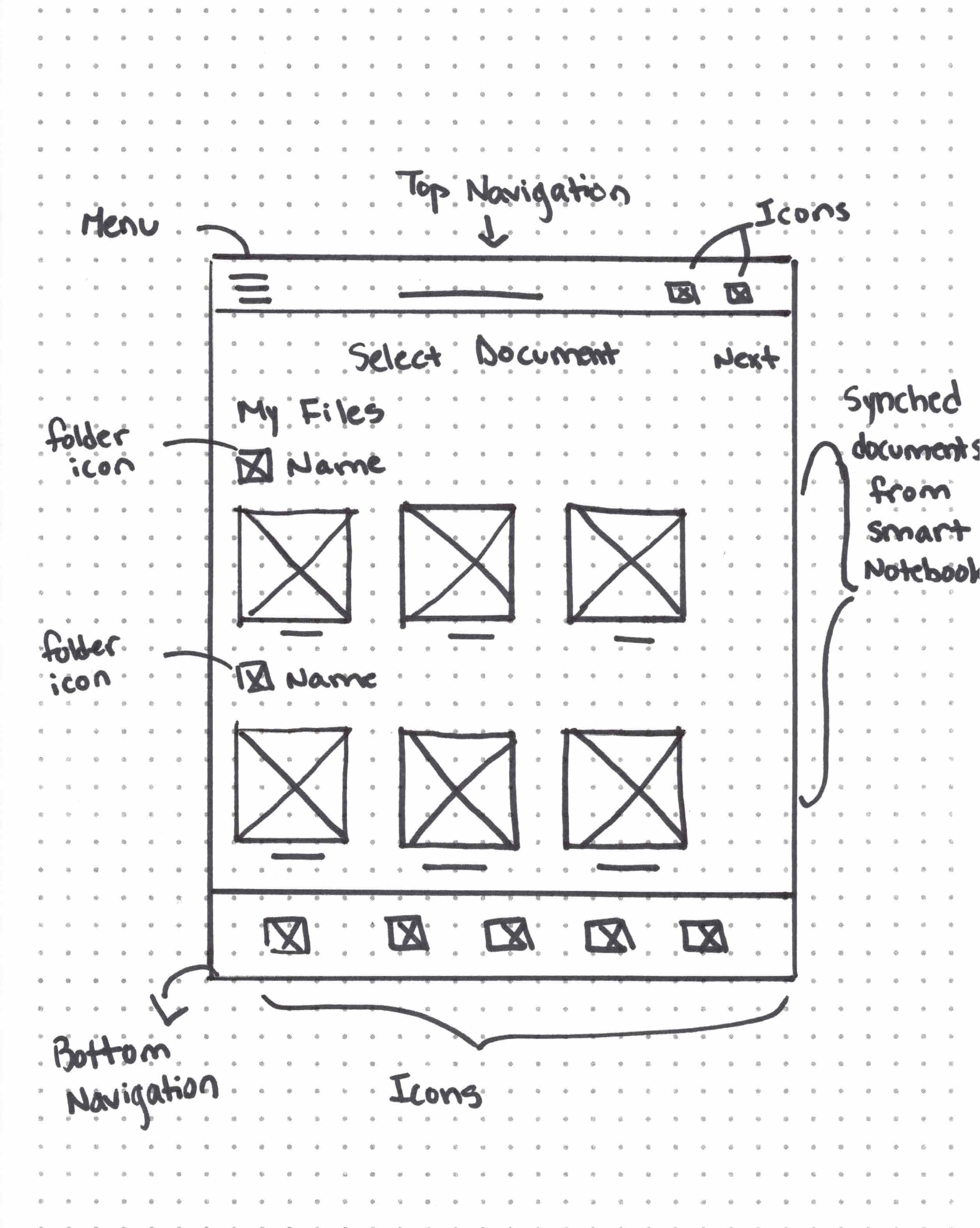
Paige could select a previously created document from her synched folders, make a new post, add an engaging title and description and select one or more communities to share her work.
Ink Blueprint: Page by Page
Information Architecture
Keeping Paige in mind, my team and I created a hierarchy site map to display how information will be organized as well as to depict the relationship between various sections and pages that users could interact with in Moleskine Connect.
Pages Paved in User Stories
User Journey Map
My team and I created a user journey map in order to outline the processes, needs and emotional states that Paige would have as she goes through the process of trying to share her poetry with other creative writers in a community on Moleskine Connect.
From Pencil to Pixel: Ink Origins
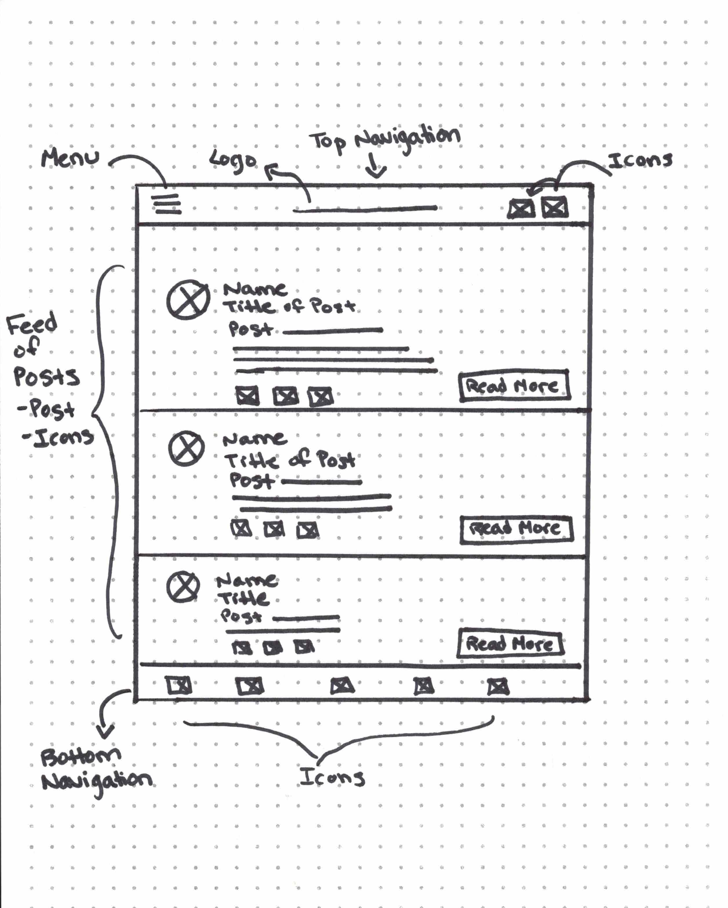
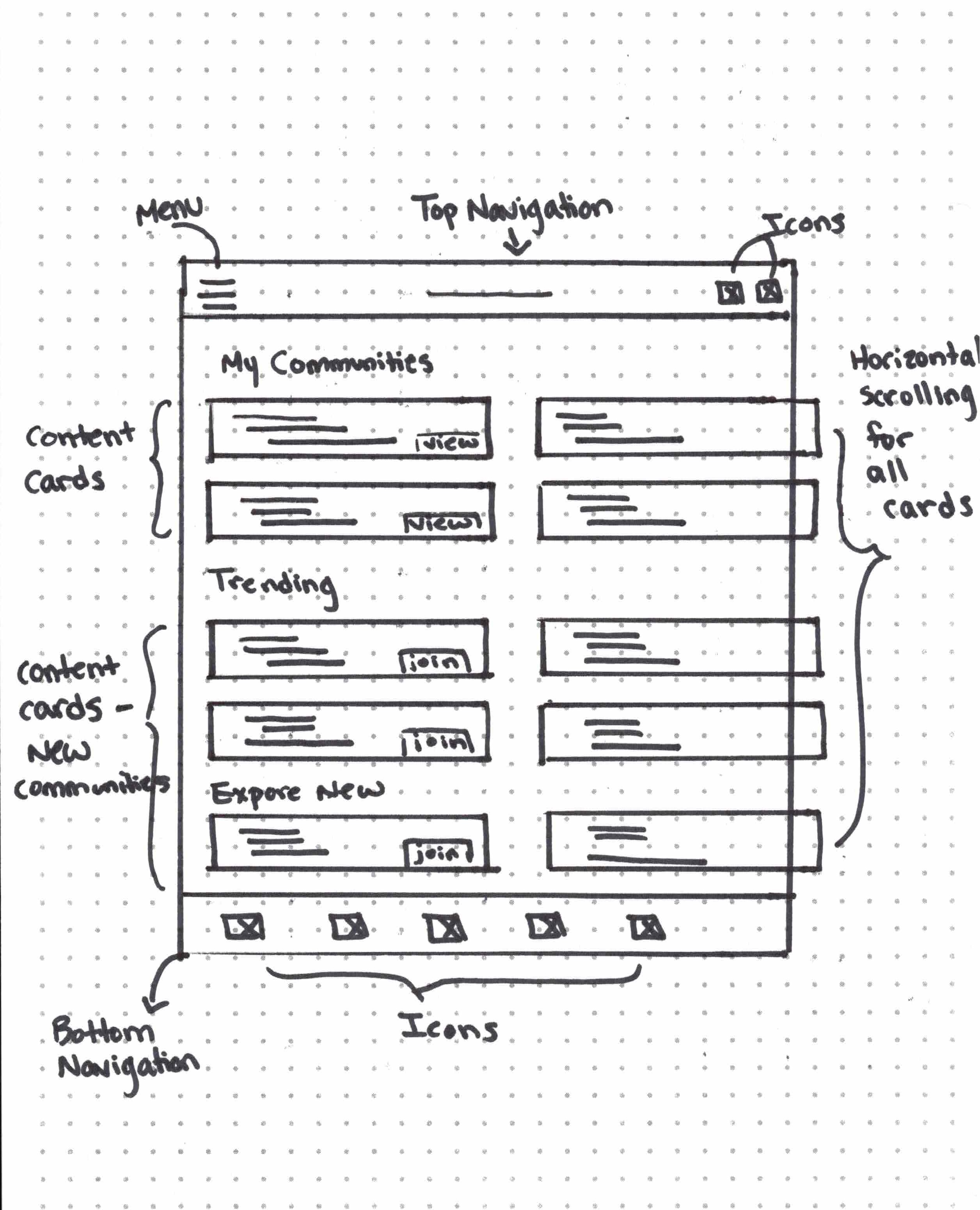
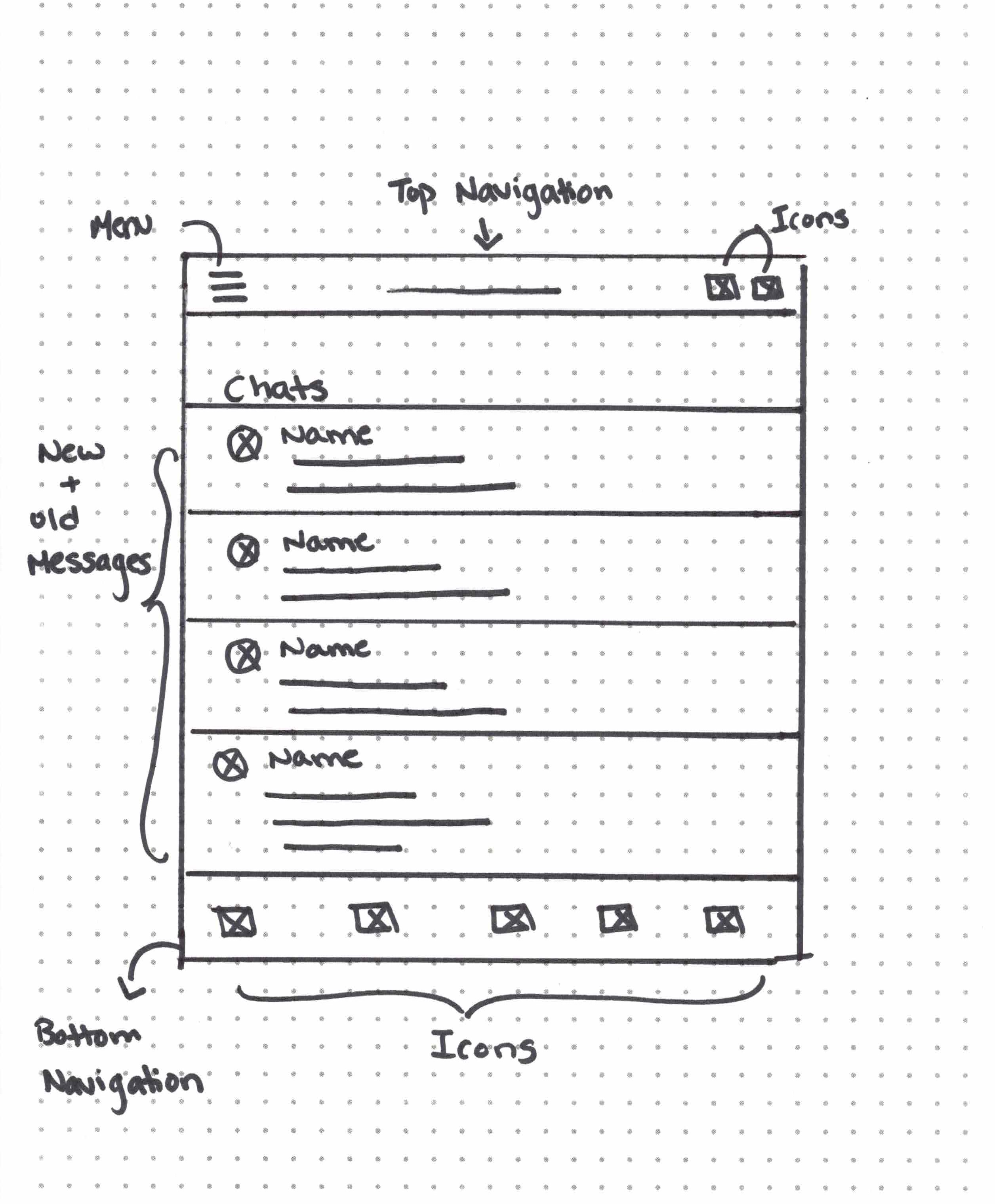
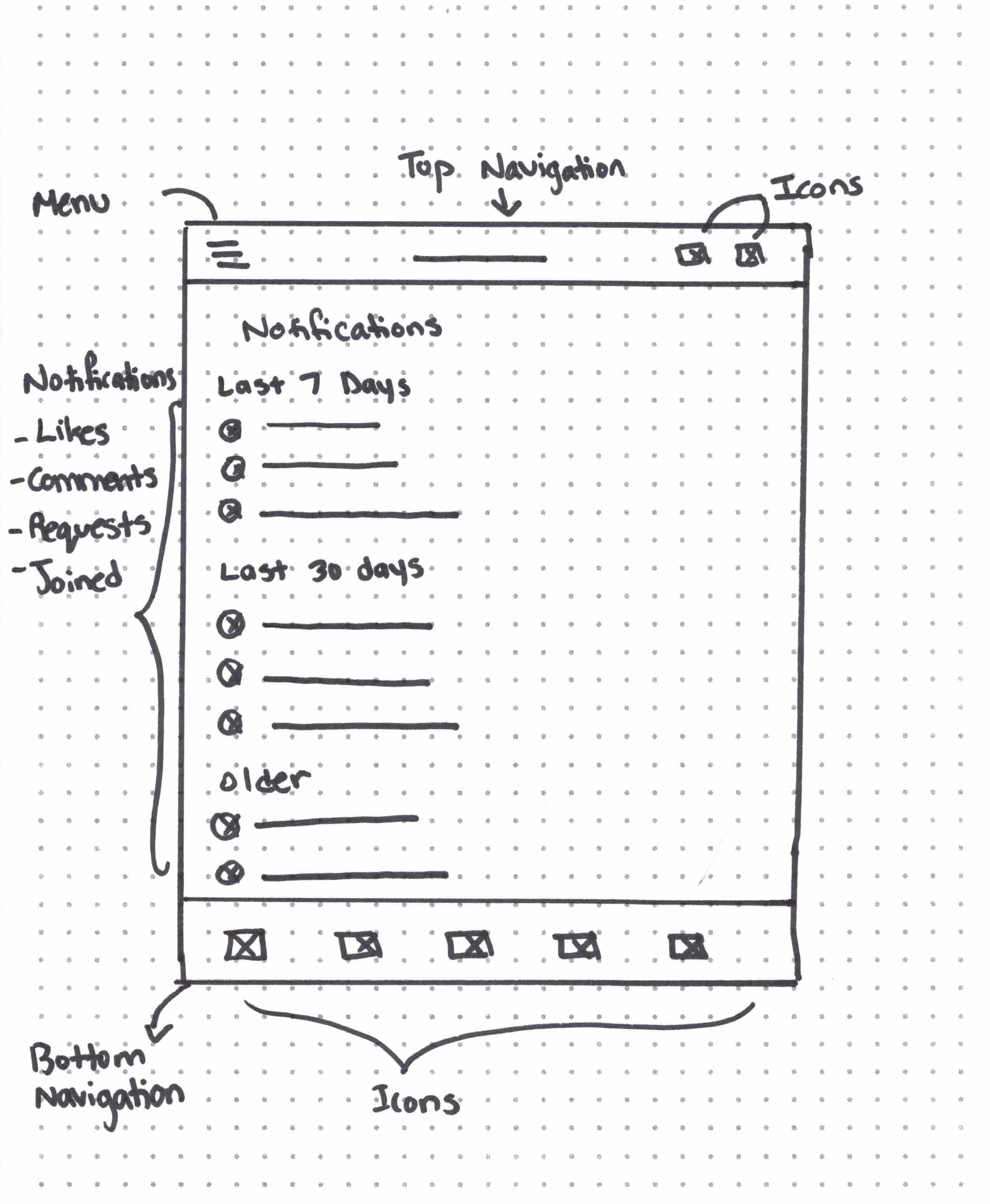
Sketches
Keeping our user flow in mind, my team and I each created sketches during a design studio.
Within my sketches, I wanted to display the potential features that could be incorporated within Moleskine Connect.
Notes Under the Microscope
Usability Testing
Utilizing mid fidelity prototypes, I conducted usability testing to determine what specific difficulties users had when attempting to create a post and share their work to a specific community on Moleskine Connect.
After analyzing the data and identifying key patterns and insights, I made iterations within the high fidelity design.
Pattern
Participants were confused how to view who liked a post.
Insight
Users want common icons to replicate assumed functions.
Solution
Modified clickability so that users can view all likes and/or comments by clicking on the icons beneath the posts.
Before

After

Pattern
Participants were initially unsure of how to create a post.
Insight
Users could not easily locate the create button displayed on the bottom navigation bar.
Solution
Changed the create icon, enlarged the supporting text and distinguished the button from the rest of the options on the navigation bar.
Before

After

Pattern
Participants were confused by the language of ‘edit post’ thinking they could edit their documents.
Insight
Users need clear language indicating the available actions.
Solution
Modified the language from ‘edit post’ to ‘compose post’ to make the actions more clear.
Before

After

Pattern
Participants were initially unsure of how to navigate to the profile page.
Insight
Users need clear cues of how to navigate to different pages on an application.
Solution
Moved the profile icon from the top navigation bar to the bottom navigation bar so that all main actions could be found within the central navigation.
Before

After

The Grand Note Finale
Final Version
Styling Notes: The Manual
Style Guide
When crafting the color palette and selecting the typography for Moleskine Connect, my paramount objective was to preserve the timeless aesthetics synonymous with the Moleskine brand. I utilized the Moleskine website and applications as inspiration but wanted to ensure that all styles met accessibility standards. I discovered that the hover state color on Moleskine's website did not comply with accessibility guidelines, prompting me to meticulously choose alternative colors that prioritize inclusivity while maintaining the brand's visual identity.In the Moleskine Connect logo, I chose Copperplate for the word ‘Moleskine’, a sans-serif typeface recognized for its bold, elegant appearance that closely aligns with Moleskine’s current logo. To infuse a touch of creativity, I paired Copperplate with a playful script-like font for the word ‘Connect’, capturing the essence of Moleskine's elegance with an artistic flair. For body text, Helvetica Neue, a versatile sans-serif font, was chosen for its clean, simple letterforms, neutrality, and clarity, ensuring a clear and readable user experience throughout the app. These combinations aim to strike a balance between sophistication, creativity, and usability within the Moleskine social network.
Ink-clusive: Notes for All
Accessibility Considerations
Conveying Information
Labels and icons were used in addition to color to emphasize points and distinguish content.
Sufficient contrast
Tested all colors to ensure that contrast met WCAG compliance.
Reflections
Through the process of designing a new social media application for Moleskine, I gained valuable insights into the intricate world of user experience design. Collaborating with a diverse group, I learned the significance of balancing creativity with functionality to create a seamless and user-friendly platform.
This experience has not only helped to refine my technical skills but has also instilled in me the importance of empathy-driven design, ensuring that the end product truly resonates with the users' needs and enhances their overall experience.