← All work

Case study · KnowNative · Web dashboard

Helping language learners organize and prioritize what they study

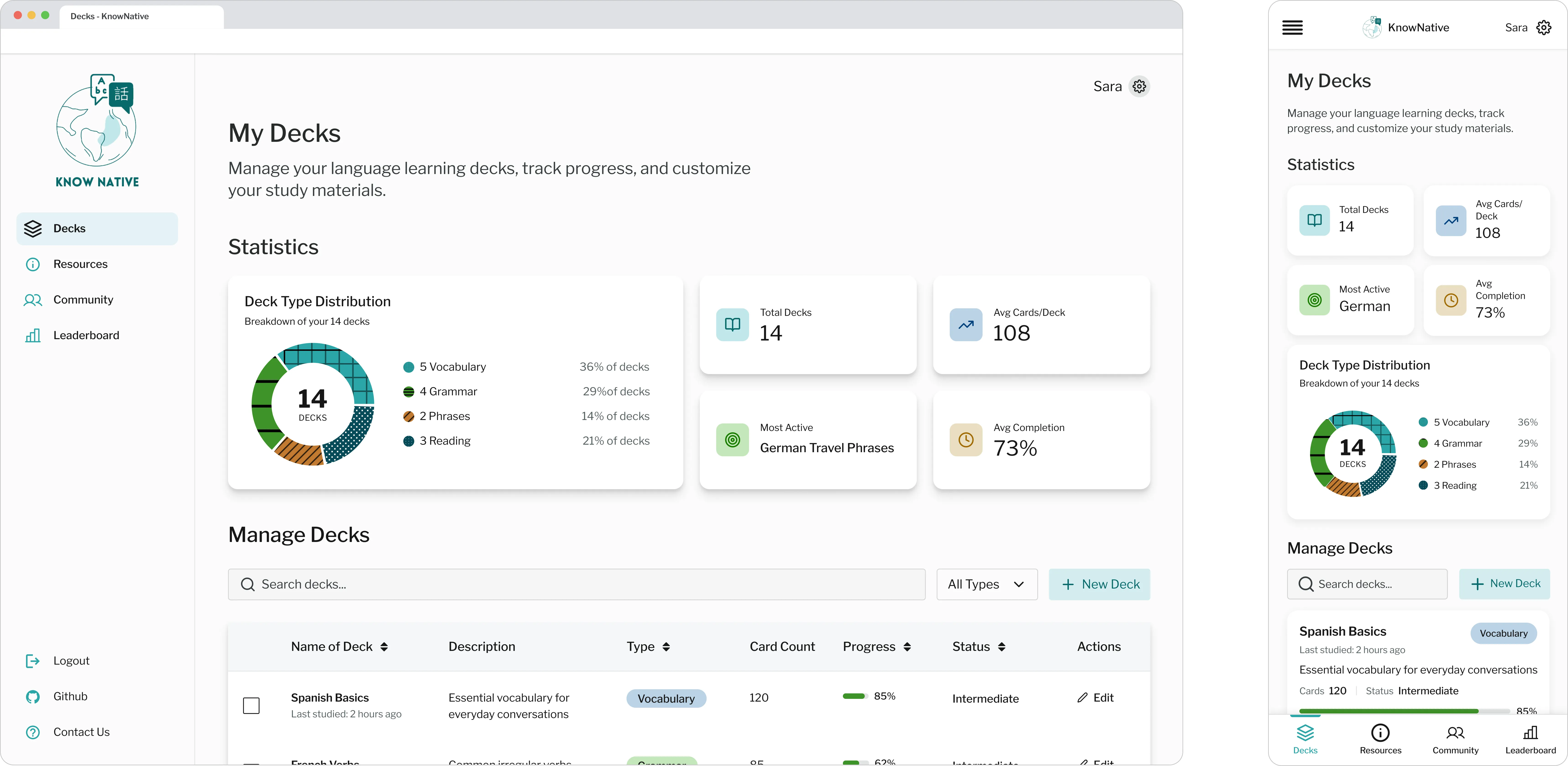
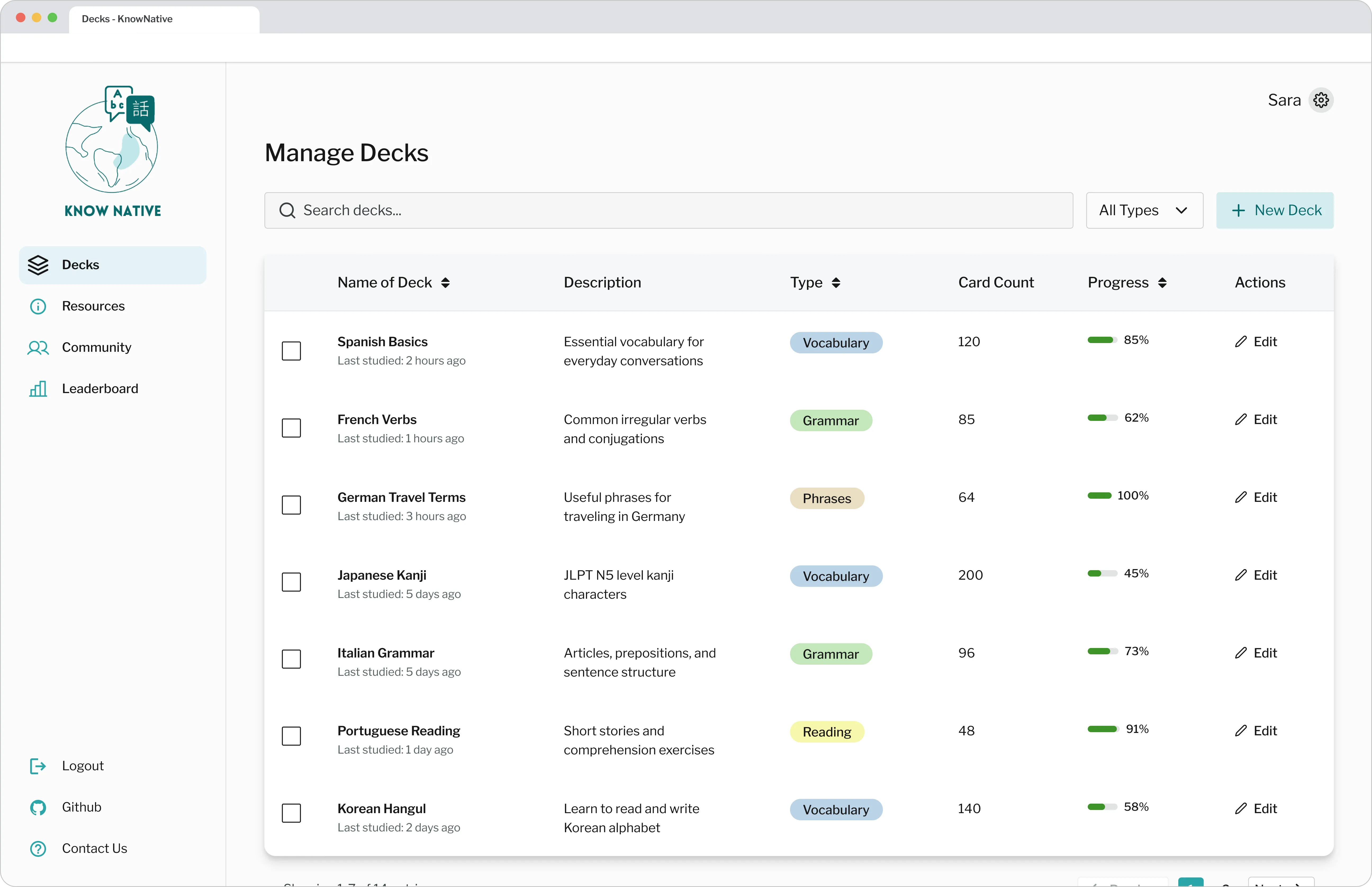
I designed a centralized dashboard for KnowNative, a language-learning platform, giving users one place to organize their custom study decks, track their progress, and decide what to study next.

KnowNative dashboard, deck table and progress screens

Role

Lead UX Designer

Team

UX Designers, Developers and Product Managers at KnowNative

Timeline

3 weeks

Tools

Figma, FigJam, Maze, Canva, Notion, Trello

Problem & solution

Learners were building libraries they couldn't keep track of.

Problem

  • No clear way to measure progress over time
  • Uncertainty about what to study next
  • Large collections of decks were hard to organize

Solution

  • A centralized dashboard for organizing and managing decks
  • Visible progress tracking that highlights what needs attention
  • Filtering and sorting to simplify large libraries

Research & key insights

Learners needed progress they could see and act on.

Competitive analysis

Ran a pluses-and-deltas analysis of language learning and study platforms to see how they organize learning content.

  • Visible progress indicators support motivation
  • Strong organization systems improve usability
  • Metadata helps users understand and manage study material
User interviews

Interviewed language learners about how they manage, organize and study language learning materials.

  • Learners want to see how far they've come
  • Content breakdowns reveal gaps and imbalances
  • Knowing when content was last studied guides review
  • Filtering and sorting are essential at scale

Design decisions

Three principles shaped every screen.

Designed for

Progress visibility

  • Progress bars with percentage labels
  • "Last studied" metadata on every deck

Designed for

Learning insight

  • High-level study statistics
  • Content distribution across deck types

Designed for

Organization

  • Clear labels and subject tags
  • Filtering and sorting tools

Validation & iteration

Testing revealed where users got stuck.

I usability tested high-fidelity prototypes to find where users struggled to navigate, organize and prioritize their content.

Raw progress → proficiency status

Round 1 · Hi-fi

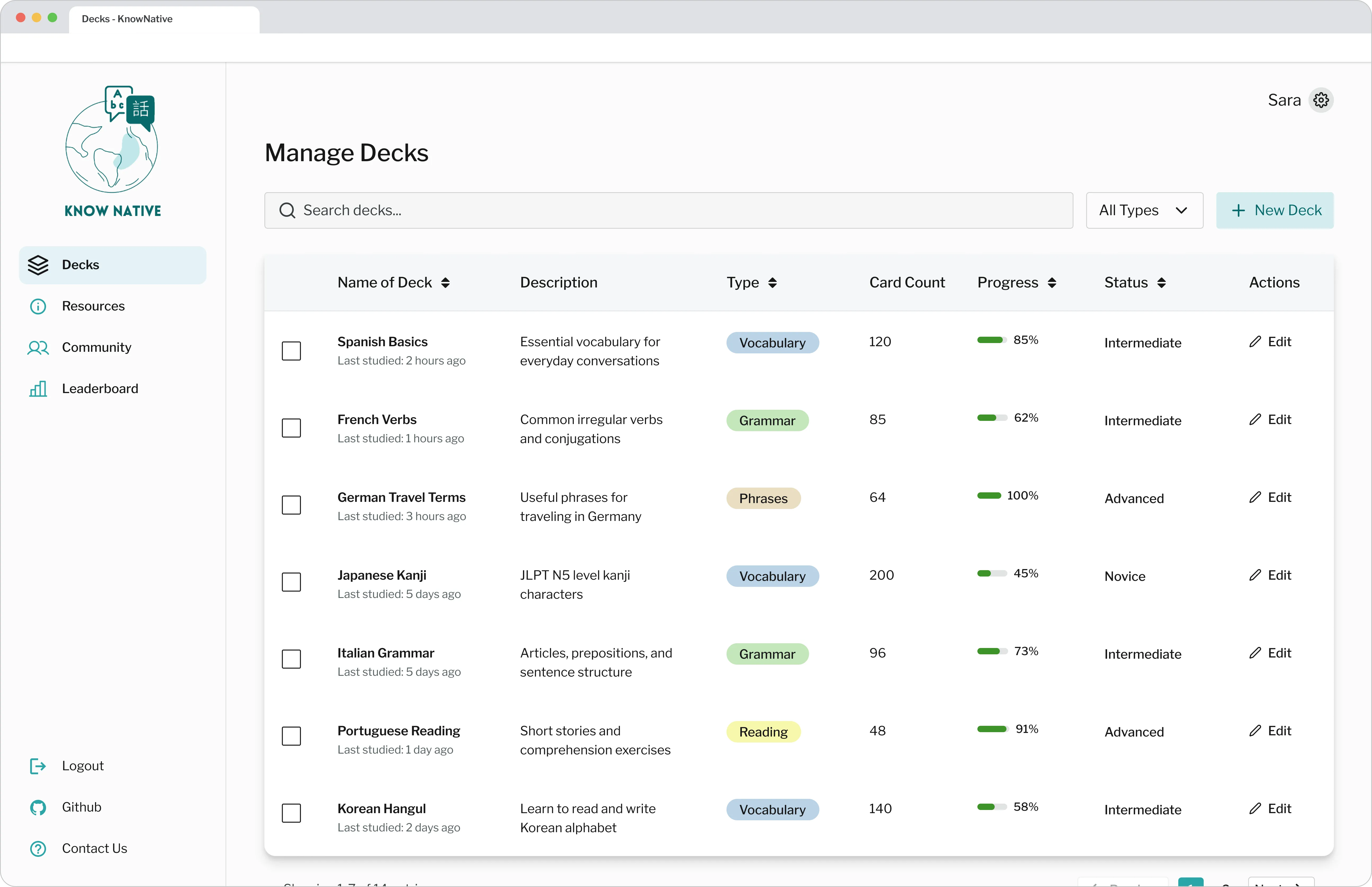
Before
Before, deck table showing raw progress only
After
After, deck table with Novice, Intermediate and Advanced labels

Pattern

Participants couldn't tell which decks they were least fluent in.

Insight

Users need a clearer way to understand learning priority, not just activity history.

Change

Added Novice, Intermediate and Advanced status labels to the deck table.

Distribution diagram → donut chart

Round 1 · Hi-fi

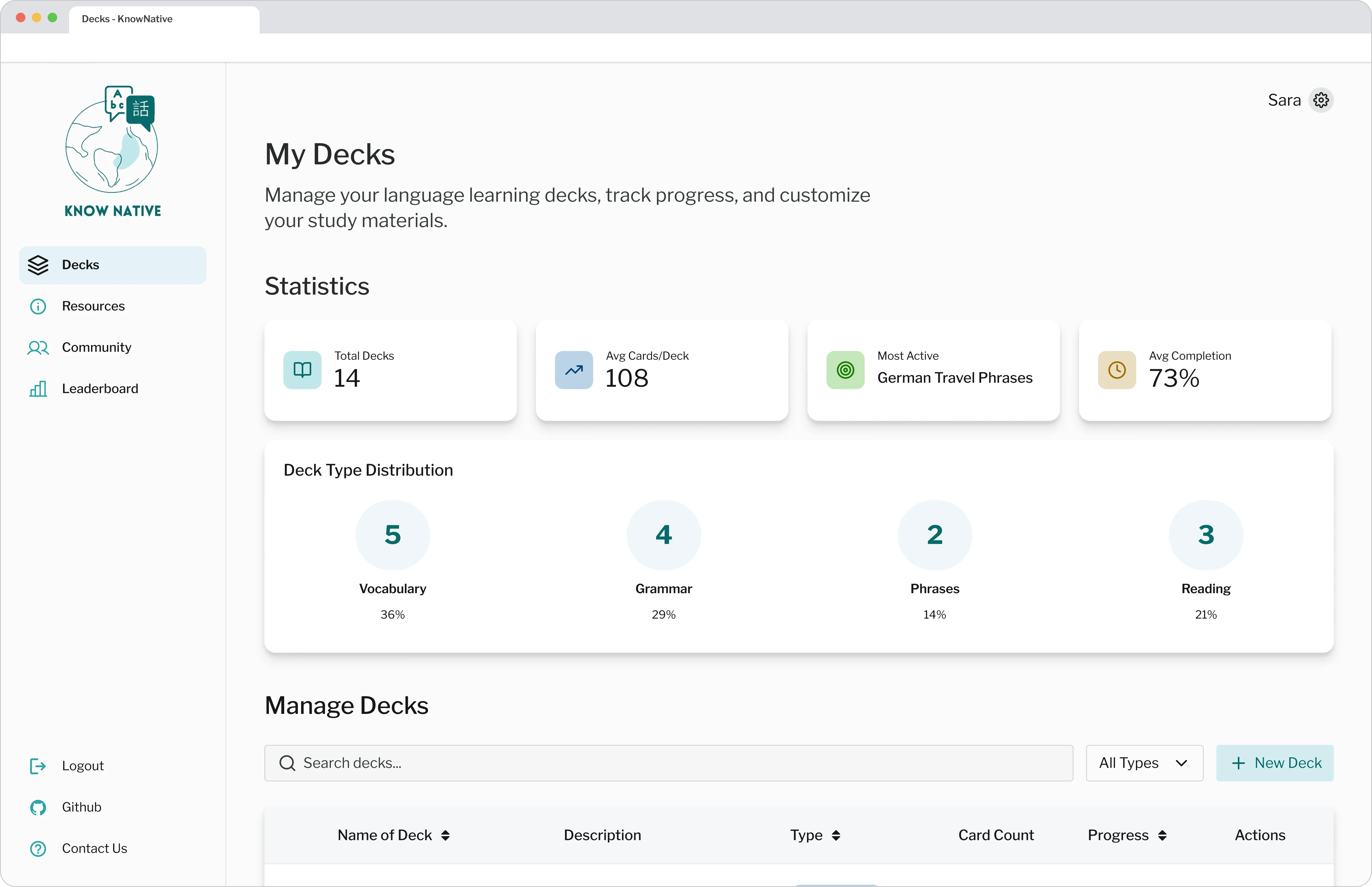
Before
Before, deck type distribution diagram
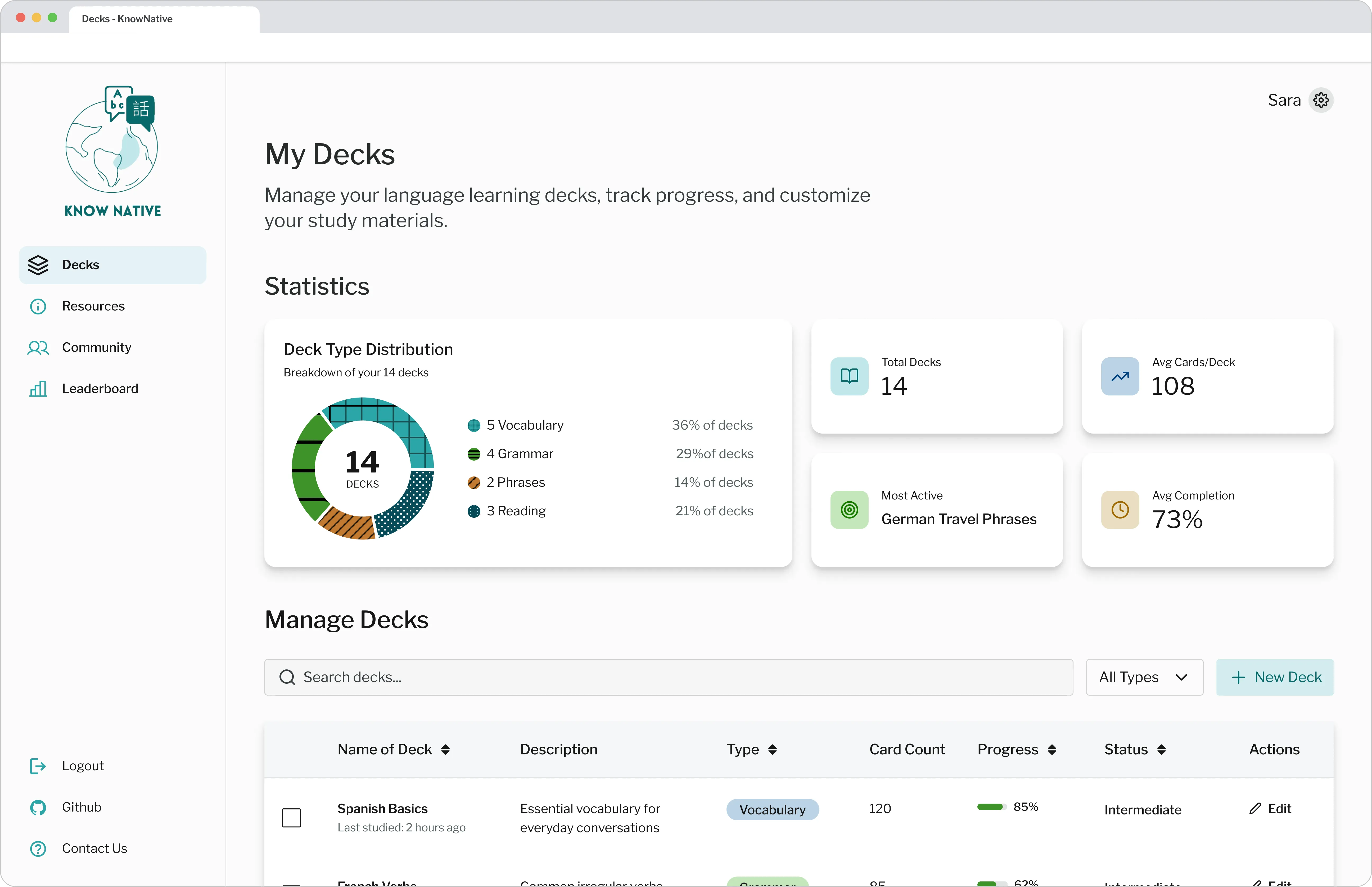
After
After, deck type donut chart

Pattern

Participants found the deck type distribution diagram confusing and mistook it for an interactive element.

Insight

Users rely on familiar visualization patterns and clear interaction cues.

Change

Replaced the diagram with a donut chart that shows proportions at a glance.

Impact

What the dashboard is built to change.

  • Faster content discovery

    One central place to find every deck.

  • Increase learning confidence

    Progress and knowledge gaps stay visible.

  • Smarter study priorities

    Learners can focus where they need it most.

  • Less time managing

    Organization tools keep large libraries in check.

Reflection

What I learned and what comes next.

Key learnings

  • Balance information density with visual clarity to maintain user focus
  • Prioritize clarity over creative novelty to ensure focus on the data
  • Data drives behavior change when it is actionable

Next steps

  • Design an archive state for mastered decks
  • Enable deck sharing with language partners
  • Explore personalized statistics based on study behavior