← All work

Case study · Elli's Desserts · eCommerce

Turning a Google Form into a bakery's online storefront

I designed an eCommerce website to replace Elli's Desserts' form-based ordering, so customers could browse products, check ingredients and allergens, and place custom orders with confidence.

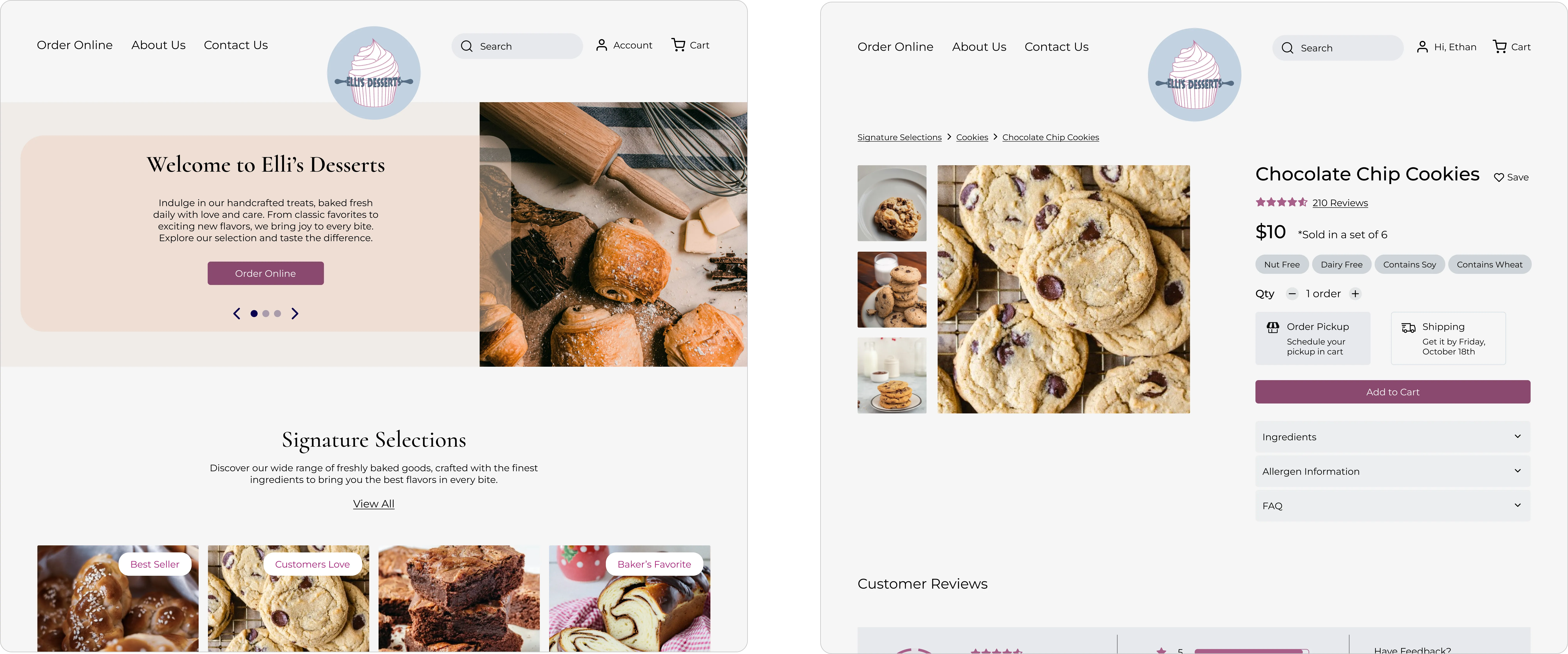
Elli's Desserts homepage, product page and checkout screens

Role

Sole UX Designer

Team

Solo designer, with Elli's Desserts as client

Timeline

8 weeks

Tools

Figma, FigJam, Maze, Trello

Problem & solution

Customers wanted to order, but the form gave them nothing to go on.

Problem

  • No product photos or descriptions to guide choices
  • No visibility into ingredients or allergens
  • A fragmented flow that discouraged repeat orders

Solution

  • Browsable product pages with enticing imagery
  • Clear ingredient and allergen details for every item
  • Order customization and a streamlined checkout

Research & key insights

Trust was the foundation of every order.

Competitive analysis

Ran a feature analysis of eCommerce websites to find gaps and features that could enhance Elli's ordering experience.

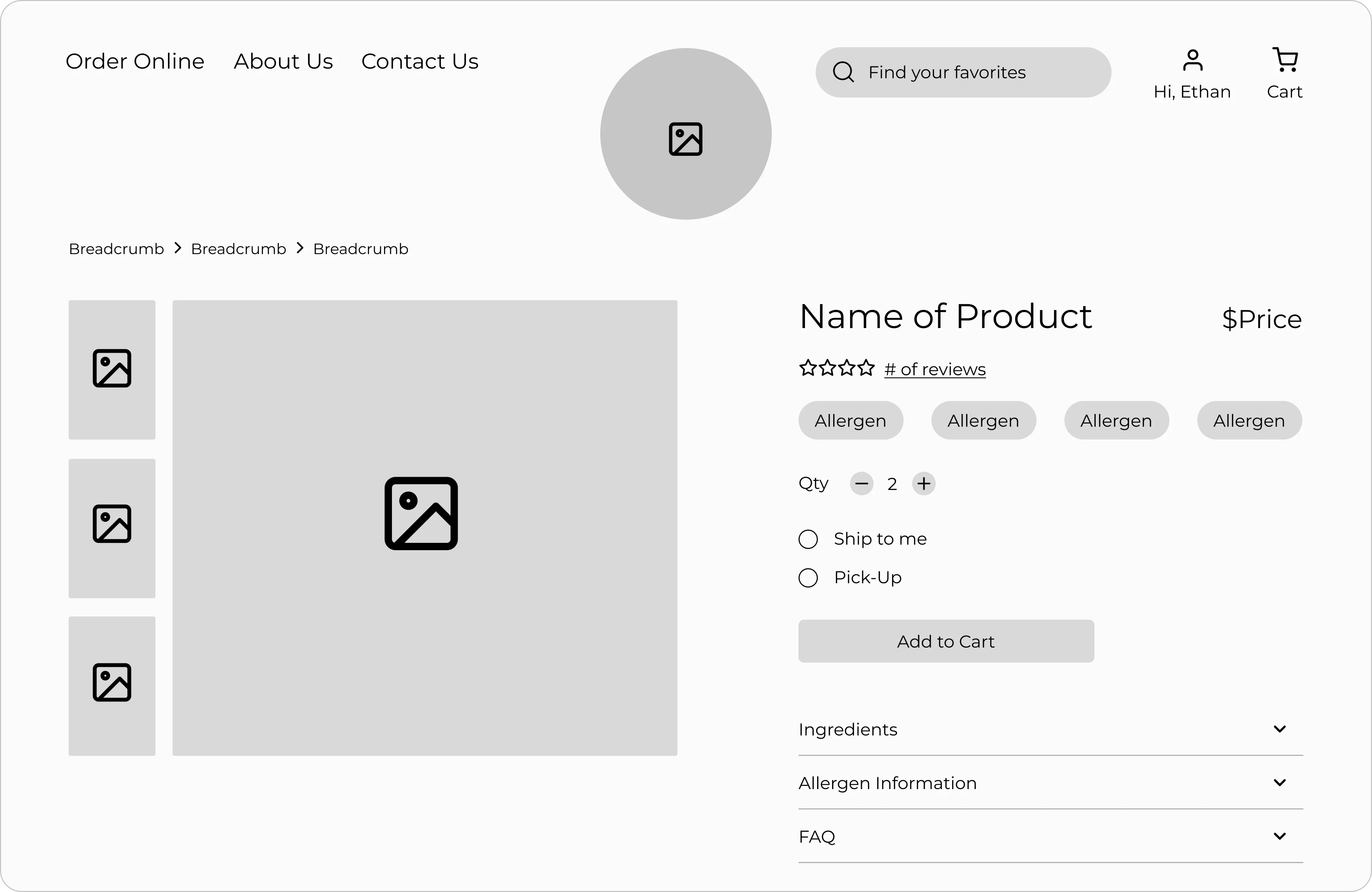
  • Ingredients and allergens must be easy to find
  • High-quality imagery drives purchase confidence
  • Customization options are expected
  • Product reviews support decision-making
User interviews

Interviewed customers about buying baked goods online and what makes them trust a bakery.

  • Customers want to see products before buying
  • Reordering and leaving special requests are high-value actions
  • Allergen transparency is critical for trust and safety
  • Saved information speeds up checkout

Design decisions

Three principles shaped every screen.

Designed for

Trust

  • Prominent product imagery and information
  • Clearly labeled ingredients and allergens sections

Designed for

Efficiency

  • Account-based reordering
  • Special request fields at checkout

Designed for

Discoverability

  • Product filters and recommendations
  • Clear navigation and information hierarchy

Validation & iteration

Testing revealed where the order flow fell short.

I tested mid-fidelity prototypes to find where customers struggled to search for and buy baked goods, then carried the fixes into high fidelity.

Hidden fulfillment options → prominent buttons

Round 1 · Mid-fi

Before
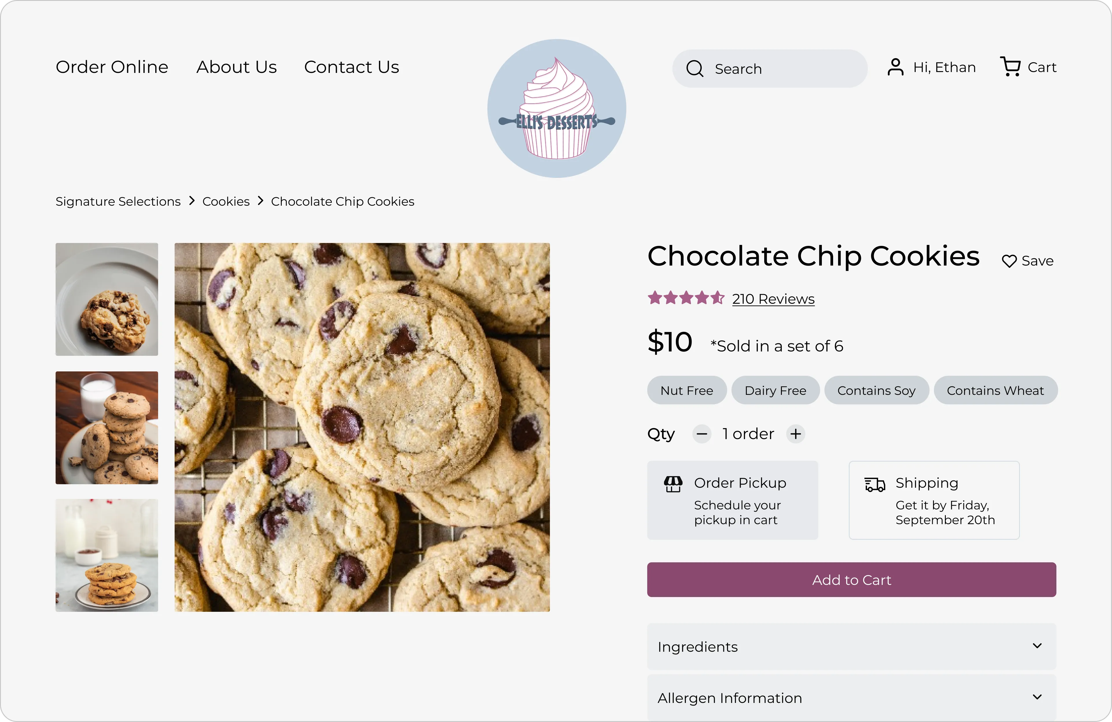
Before, small pickup and shipping options
After
After, larger pickup and shipping buttons with distinct colors

Pattern

Participants missed the required pickup and shipping options before adding to cart.

Insight

Users need required actions to stand out.

Change

Resized and restyled the buttons with distinct colors and labels.

Collapsed details → always-visible summary

Round 1 · Mid-fi

Before
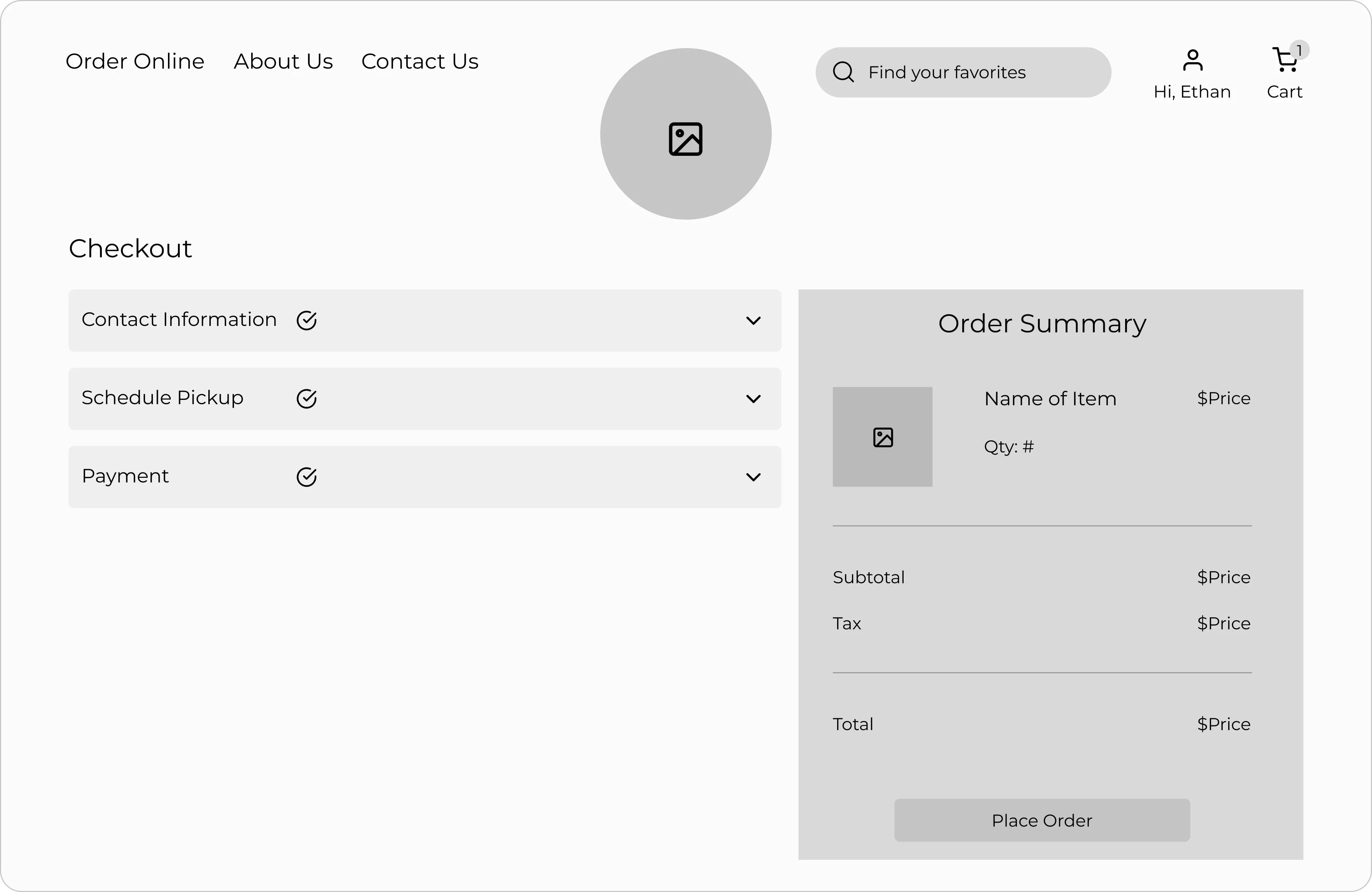
Before, checkout details inside a dropdown
After
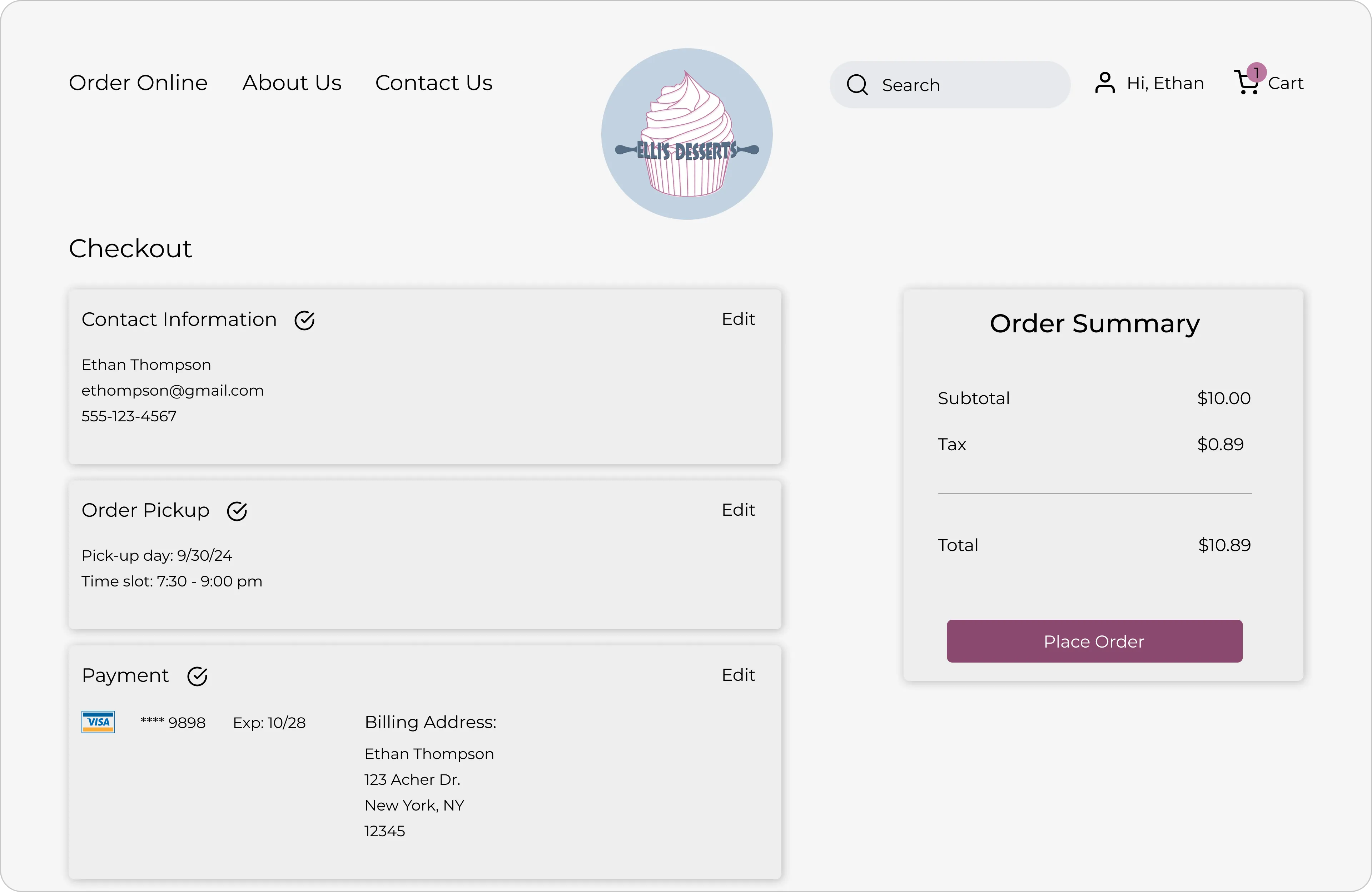
After, checkout details always visible

Pattern

Participants opened the dropdown to review their details before buying.

Insight

Users want to verify their information before placing an order.

Change

Removed the dropdown so checkout details are always visible.

Final design

See the ordering experience in action.

A walkthrough of the final prototype, from browsing products to placing an order.

Prototype walkthrough

Browse → product listing → product details → checkout → confirmation.

Impact

What the redesign is built to change.

  • Higher user satisfaction

    A faster, more efficient way to order.

  • Less uncertainty

    Ingredients and allergens surfaced up front.

  • More conversions

    A simple, step-by-step checkout.

  • More repeat orders

    Saved preferences and easy reordering.

Reflection

What I learned and what comes next.

Key learnings

  • Ongoing client communication aligns business and user needs
  • Streamlined flows directly shape task completion
  • Strong visuals balance brand expression with accessibility

Next steps

  • Optimize the mobile experience
  • Expand accessibility features
  • Add analytics to guide future improvements