← All work

Case study · FreshTrack · Mobile app

Helping households waste less food

I led design on a mobile app that helps people track groceries and expiration dates, with reminders and recipe ideas that put what's already at home to use.

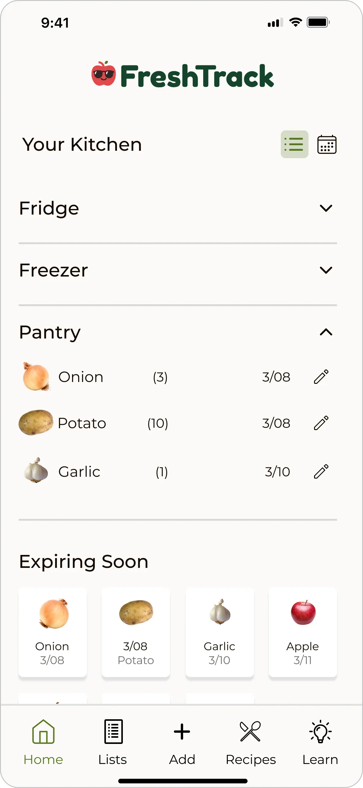
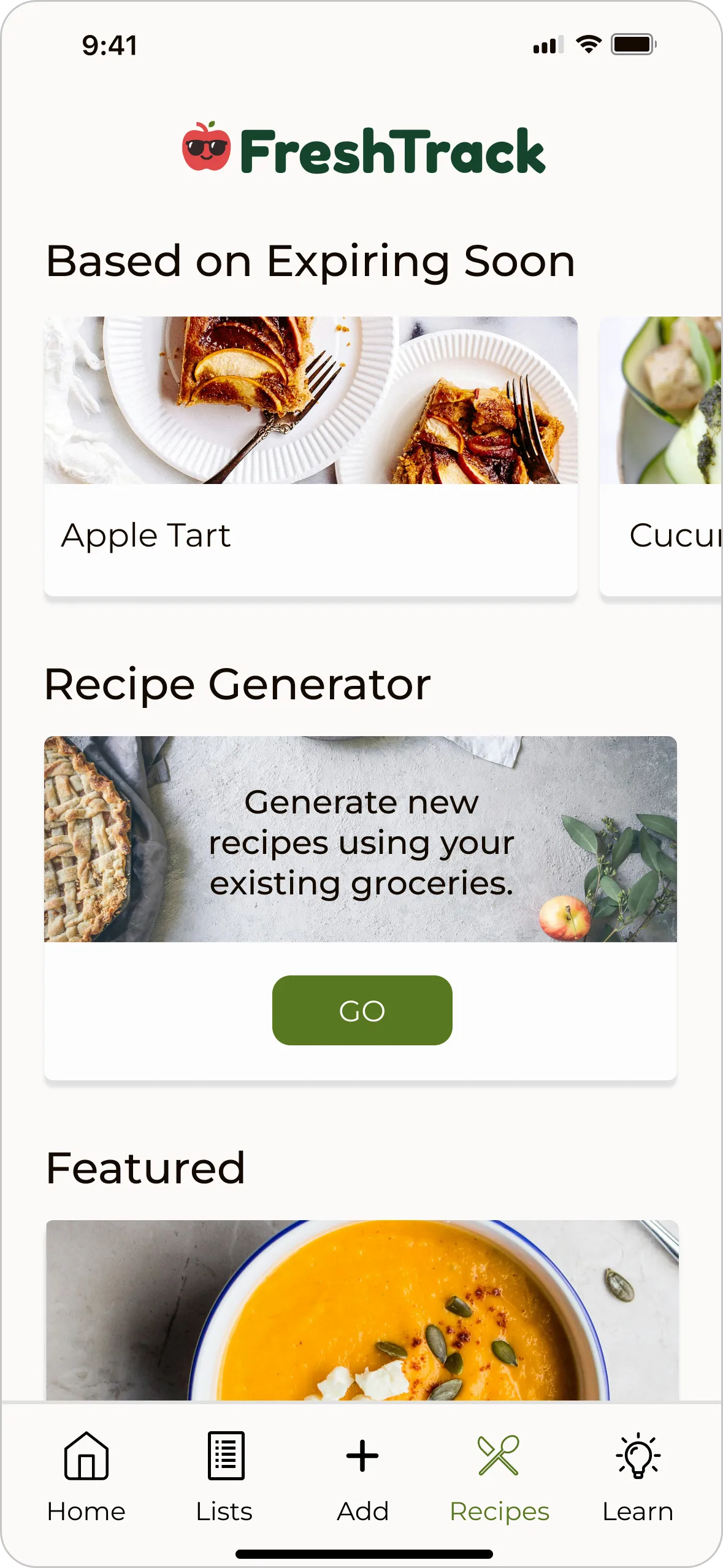
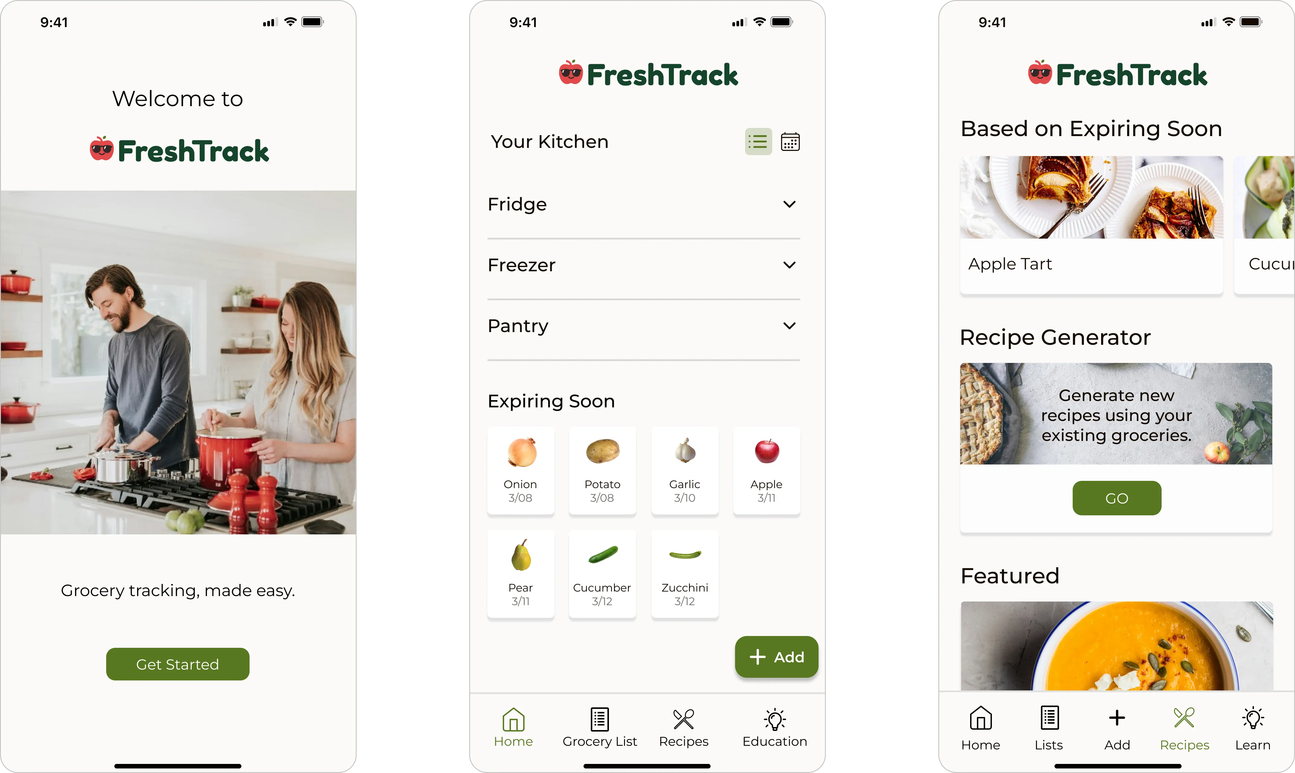
FreshTrack inventory, expiration tracker and recipe screens

Role

Lead UX Designer

Team

3 designers

Timeline

6 weeks

Tools

Figma, FigJam, Maze, Optimal Workshop, Trello

Problem & solution

People forgot what they had until it was too late.

Problem

  • No visibility into what groceries are already at home
  • Expiration dates are hard to track and easy to forget
  • Forgotten food gets thrown out and repurchased

Solution

  • Grocery lists that prevent duplicate purchases
  • One inventory to track groceries and expiration dates
  • Recipes and tips that put existing food to use

Research & key insights

Visibility and reminders were the missing habit.

Competitive analysis

Led a feature analysis of grocery and food-management applications to find gaps in the market.

  • Expiration tracking is often cumbersome and fragmented
  • Recipes from existing ingredients are underused
  • Food-waste education is rarely built in
  • Donation resources are missing or hard to find
User interviews

Interviewed people about how they manage groceries and what gets in the way of reducing waste.

  • People forget what they own and when it expires
  • Most households have no system to prevent food waste
  • Reminders and visibility are critical to behavior change
  • People want to stop rebuying what they already have

Design decisions

Three principles shaped every screen.

Designed for

Visibility

  • Centralized grocery inventory dashboard
  • Quick-add and edit flows

Designed for

Behavior change

  • Expiration-based reminders
  • Educational content on storage and waste

Designed for

Inspiration

  • Recipe suggestions generated from existing ingredients
  • Simple pathways from inventory to meal inspiration

Validation & iteration

Testing revealed what needed to be easier to reach.

We tested mid-fidelity prototypes to find where users struggled to add and track groceries, then retested in high fidelity to confirm the fixes worked.

Split expiration info → one homepage tracker

Round 1 · Mid-fi

Before
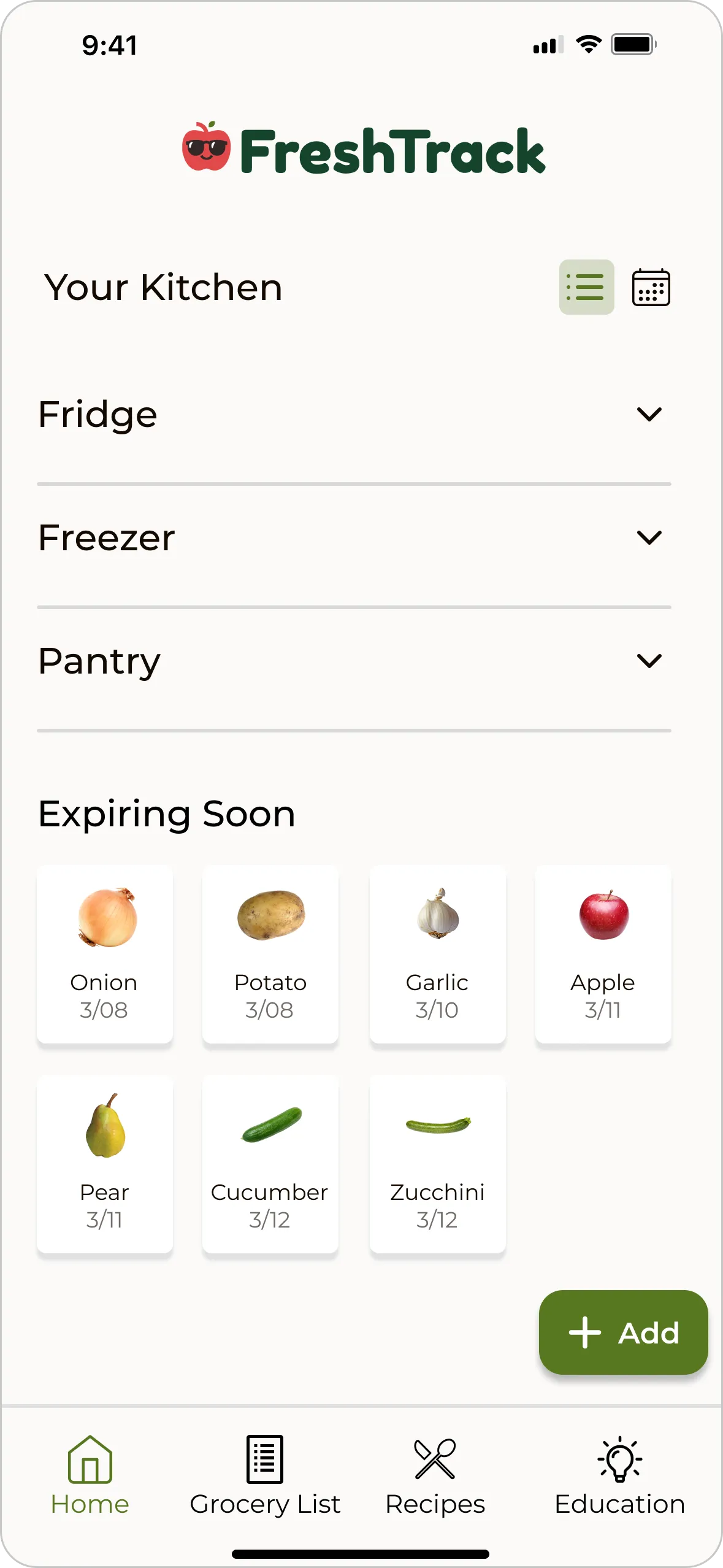
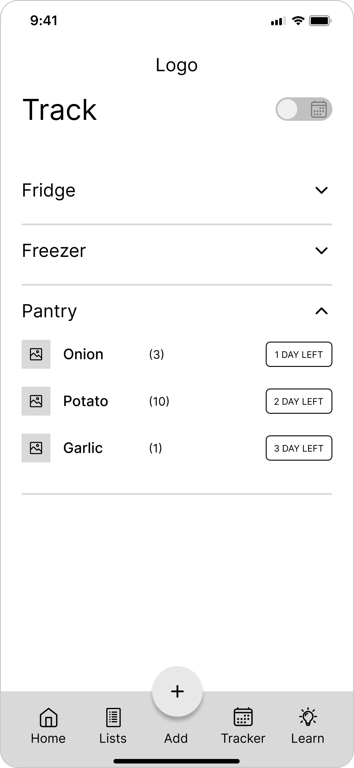
Before, expiration dates spread across two pages
After
After, expiration tracker on the homepage

Pattern

Participants were confused by expiration dates appearing on two pages.

Insight

Users want related item information grouped together.

Change

Embedded the expiration tracker on the homepage.

No guidance → onboarding

Round 1 · Mid-fi

Before
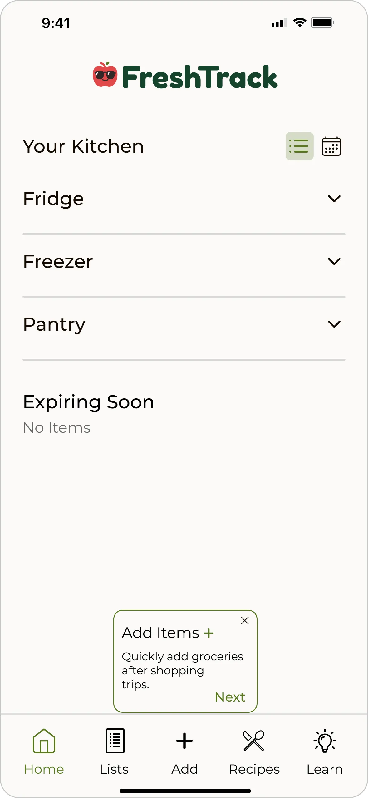
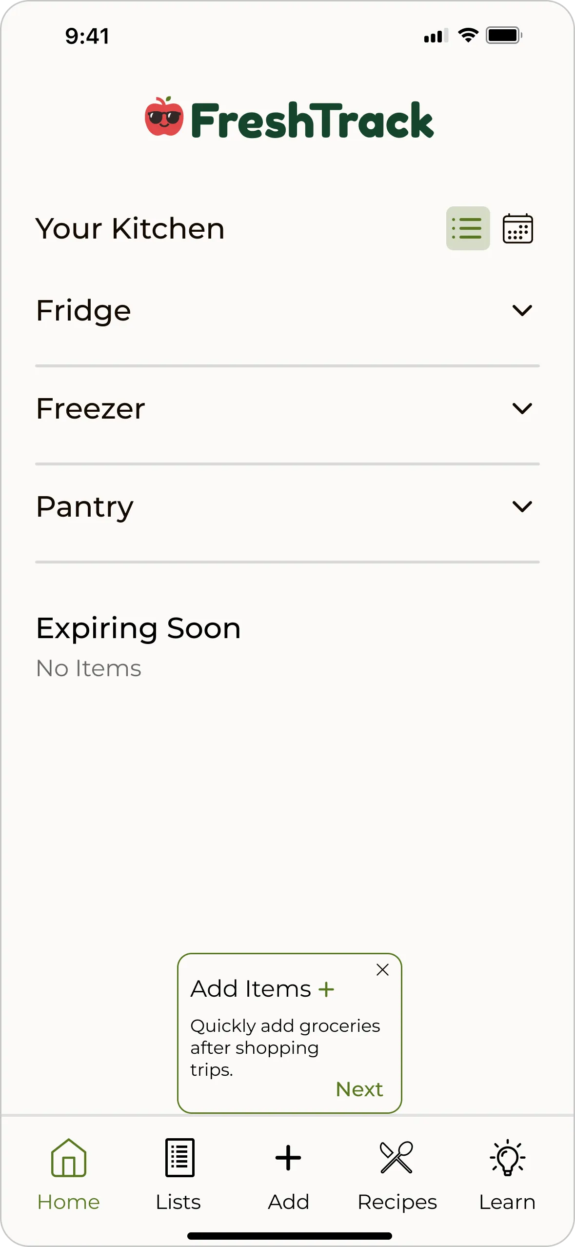
Before, app opens with no guidance
After
After, onboarding that explains how to add items

Pattern

Participants weren't sure how to add groceries.

Insight

Users need a brief introduction to a new app's features.

Change

Added onboarding that explains how to add items.

Buried recipes → bottom navigation

Round 1 · Mid-fi

Before
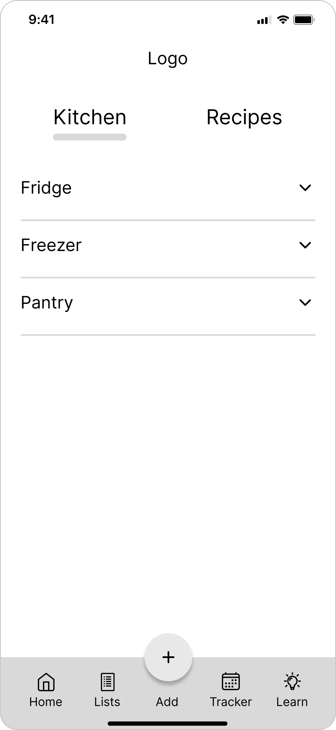
Before, recipes in a homepage tab
After
After, recipes icon in the bottom navigation

Pattern

Participants struggled to find the recipe feature.

Insight

Users need key features within easy reach.

Change

Moved recipes from a homepage tab to an icon in the bottom navigation.

Onboarding alone → floating action button

Round 2 · Hi-fi

Before
Before, adding groceries relies on onboarding
After
After, floating action button for adding groceries

Pattern

Participants were still unsure how to add groceries.

Insight

Onboarding alone isn't enough to make an action stick.

Change

Added a floating action button for adding groceries.

Final design

See the grocery tracker in action.

A walkthrough of the final prototype, from adding groceries to tracking expiration dates and finding recipes.

Prototype walkthrough

Onboarding → adding groceries → expiration tracking → making grocery lists → recipes → education.

Impact

What the application is built to change.

  • Less food waste

    Clear visibility into inventory and expiration dates.

  • Lasting habits

    Features that support ongoing food management.

  • Better use of ingredients

    Recipe ideas built from what's on hand.

  • More confident households

    Accessible tips on storage and waste.

Reflection

What I learned and what comes next.

Key learnings

  • Designing for societal impact strengthens user relevance and long-term value
  • Clear team communication keeps decisions aligned
  • Decisions work best when grounded in real constraints

Next steps

  • Make grocery categories customizable
  • Build out the recipe generator
  • Expand education on reducing food waste